DISCLAIMER: All branding, logos, product, etc... belong to 3 Howls Distillery.
In this project, I created this...
Using these steps...
We were required to choose a product image from a list of choices and combine them with a texture image from a list of choices into one image.
We were required to use at least one of each of the following items.
We were required to use at least one of each of the following items.
● Smart Objects
● Pen Tool
● Layer Mask
● Clipping Masks
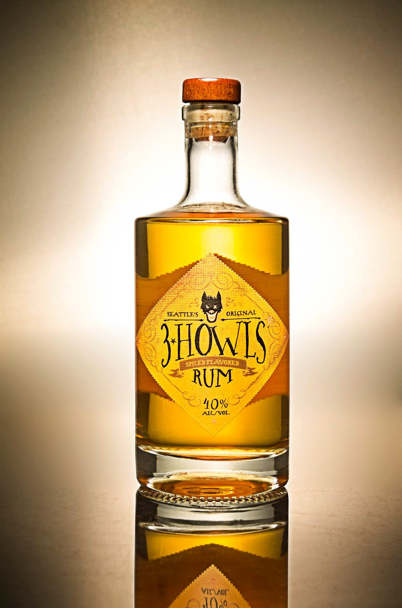
I chose the 3 Howls Spiced Rum bottle because I love the product design.
I chose the 3 Howls Spiced Rum bottle because I love the product design.
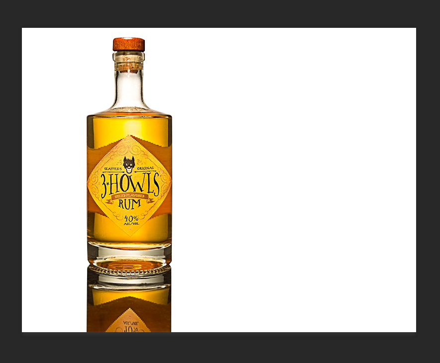
To begin, I brought the 3 Howls bottle into my canvas as a smart object. Using the pen tool, I carefully traced the outline of the bottle. I then used a layer mask to make the bottle and reflection the only thing visible. This allows me to nondestructively make any changes I need to to the bottle.
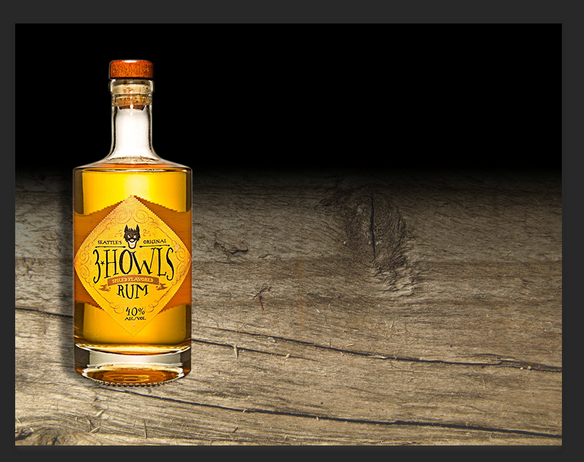
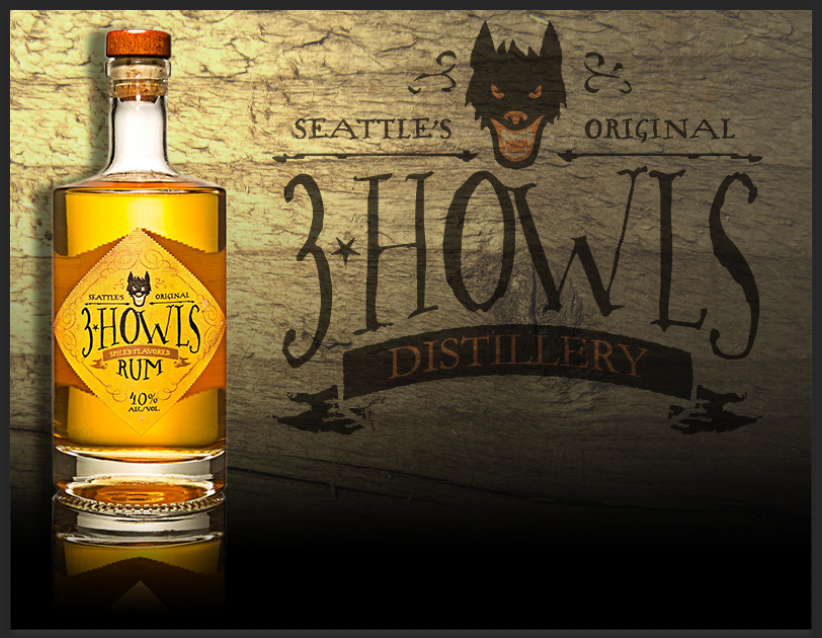
I then added Texture 064 from our folder of textures we could use. 3 Howls is a Seattle based company so I wanted to go for a rugged woodsy type theme. Again, I brought it into my canvas as a smart object and rotated it counterclockwise 90º.
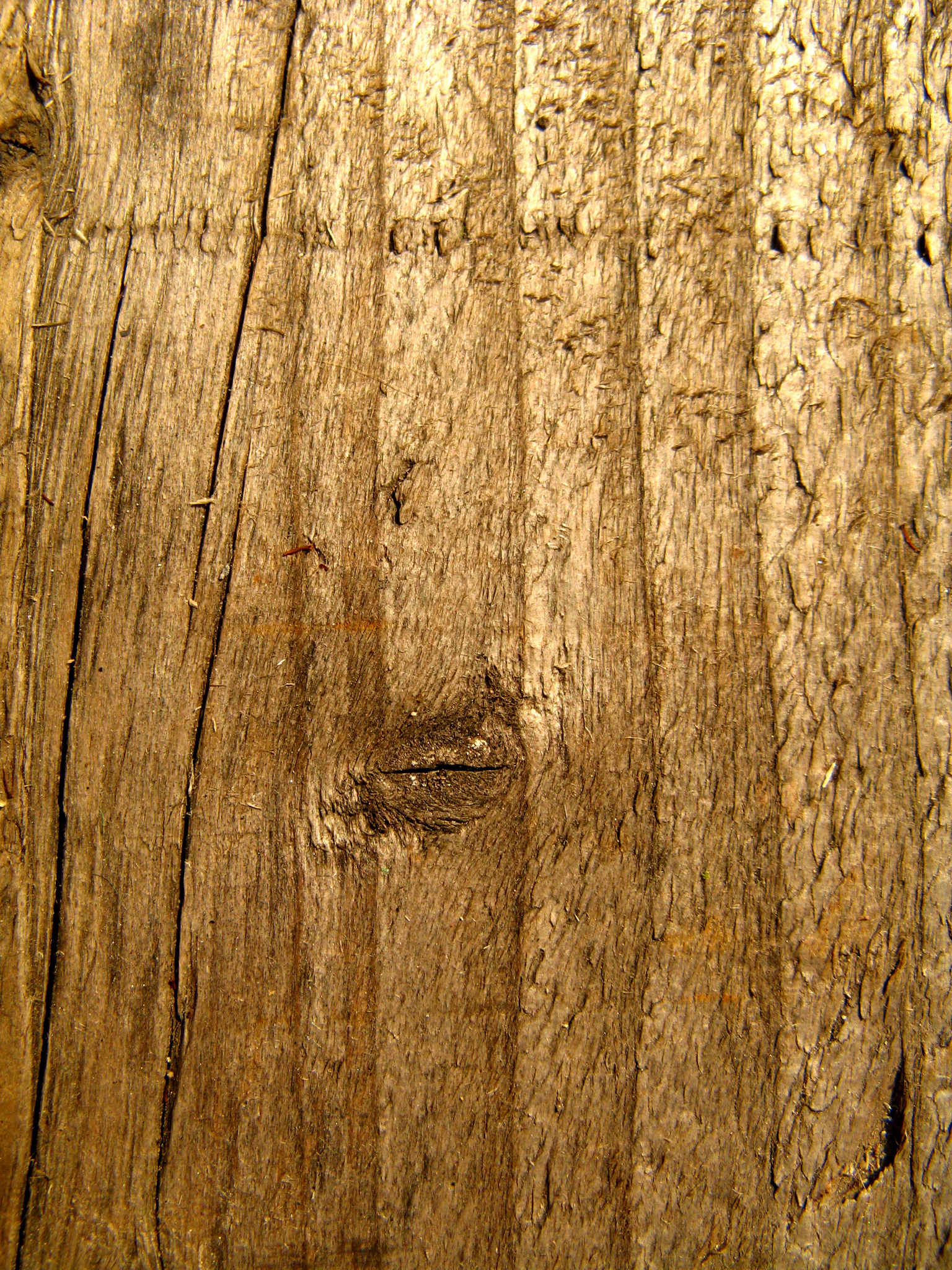
Texture 064
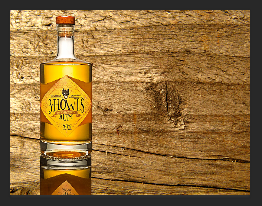
Here's what the image looks like with the texture in the background.
I found this to be a little too bold and distracting from the product, so I used a hue/saturation layer adjustment to take out some of the color in the background. In order to apply this nondestructively to the smart object, I created a clipping mask and applied it to the layer with the texture smart object. I also felt that a gradient on the background would add some depth instead of the image of a bottle just floating above a wood texture. So again, I created a gradient layer adjustment and used a clipping mask to apply it to the texture layer.
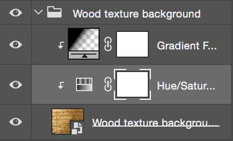
My layers panel for the Wood Texture Background Group.
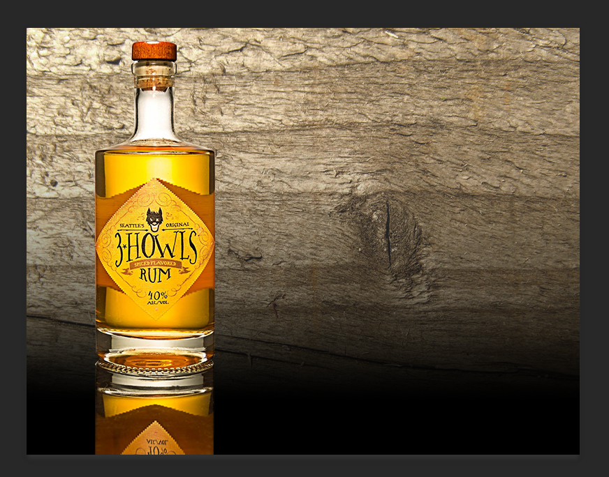
I then realized that I do not like the way the bottle's reflection looks on top of the backgroud gradient. I still wanted part of it to show, so I didn't add the gradient to both smart objects. Instead, I created a layer adjustment gradient to the bottle smart object this time. Like before I used a clipping mask to apply it to the smart object, thus making the process nondestructive.
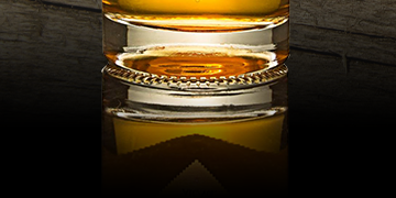
Gradient adjustment layer applied with a clipping mask on the bottle layer.
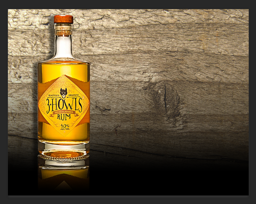
Upon looking at it, I decided that maybe I didn't like the black on top, so I swapped it all around. Since I am working nondestructively this was easy to do. I thought the wood would make more sense as a table type surface. I cut out the reflection and added a drop shadow, through the FX option in the layers panel options.
NOTE: Just because something makes more sense, doesn't mean it's a better design. I did not like this.
It didn't look as good as I thought it would. So I was able to go into history and go all the way back to where I left off. This includes the drop shadow from the fx menu on the layer options panel, as well as some adjusted feathering on the layer mask so the bottle would look like it belongs with that background a little better.
I figured now would be as good of a time as any to add the company's branding into the image, so I started searching. I was able to find a good quality image of 3 Howls branding on their Yelp page.
3 Howls Branding found on Yelp.
Only problem with this image was the background, so I took it into PS and used Color Range under the Selection tools. I then copied my selection and opened a new document in order to be nondestructive. I pasted the selection into that document on a transparent background and saved it. I then opened that document as a smart object and placed it into my canvas.
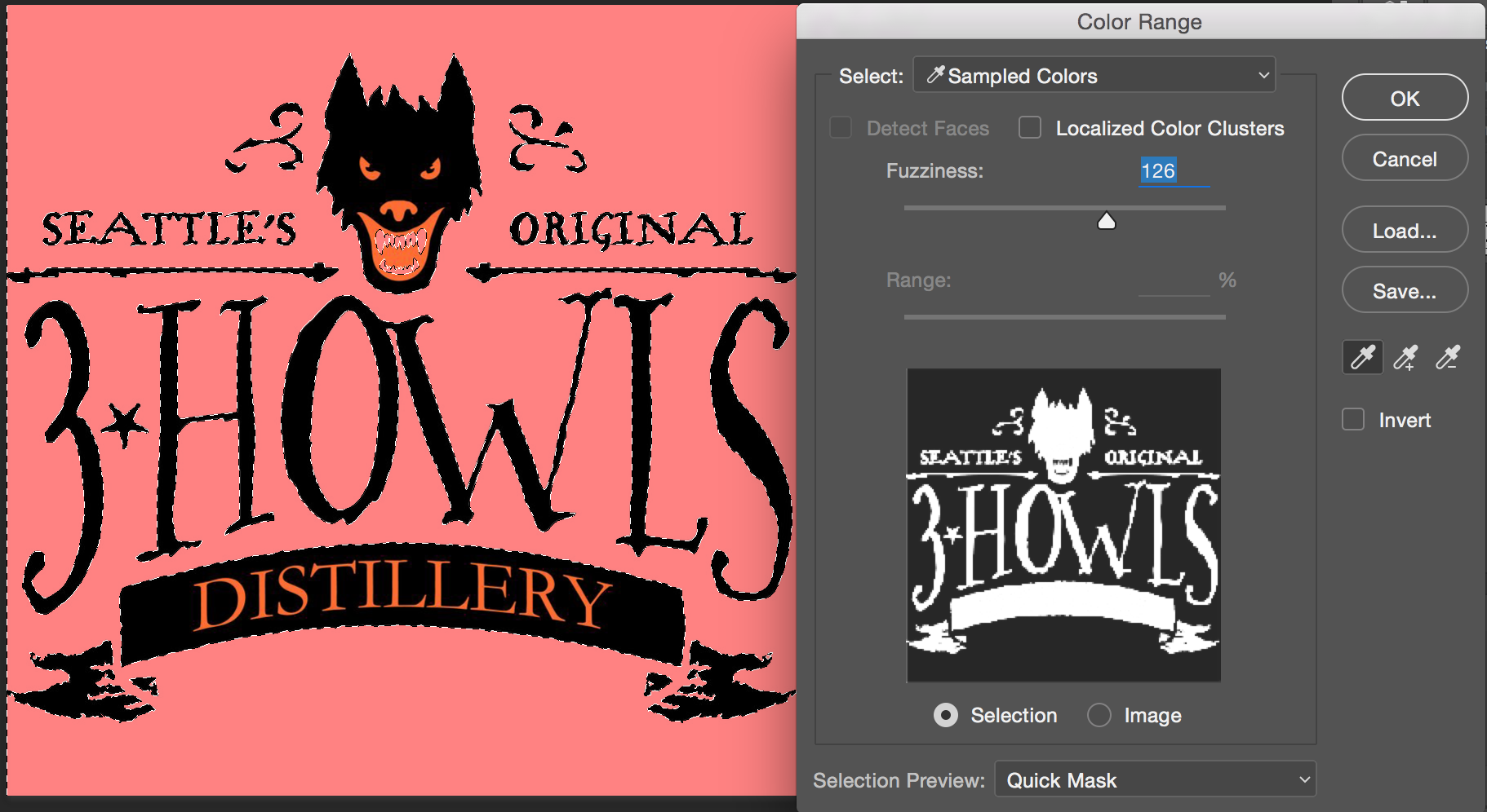
Using quick mask preview allowed me to make sure everything was selected properly.
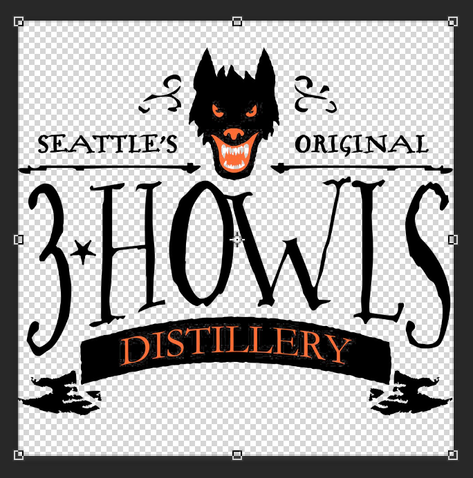
NOTE: there's a little bit of fuzziness around the eyes and on the banner, but it won't matter in the image.
In order to achieve the look I wanted for the branding, I toyed around with different blending modes. I finally decided that multiply would work best in this case, as I wanted it to appear on the wood.
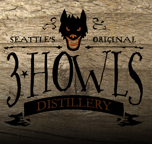
I felt this was a little bit too bold, and I wanted it to fade more, so I adjusted the layer opacity down to 65%. I also adjusted the levels through the layer adjustment tool. This allowed me to bring out the red and make the blacks a little muted.
I then took the time to clean up my layers and organize everything correctly.
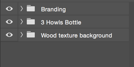
Groups in my layers panel.
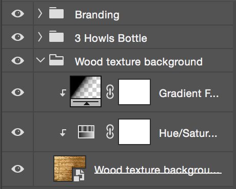
Expanded Wood Texture Background Group. Showing Smart Objects and Clipping Masks.
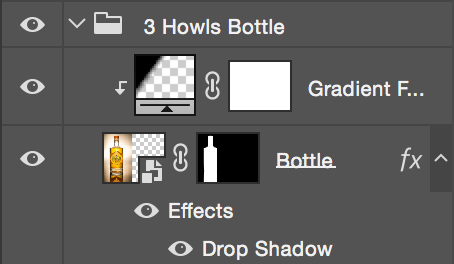
Expanded 3 Howls Bottle group. Showing Smart Objects, a Layer Mask, and a Clipping Mask.
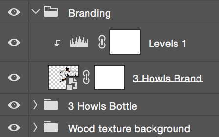
Expanded Branding group. Showing a smart object and a clipping mask.
The next step was to add a little bit of text. I wasn't sure if I even needed any text at all but I decided to throw some in there. After doing some research on this distillery I found a decent amount of design work/art that has been created for them. I found a mural that had what could be a nice slogan on it, so I decided to use that text for this image in order to create harmony. The tricky part was finding a font that matched up to their font. This was difficult because the design team Force and Form (http://forceandform.com) used hand lettering for this design, which is pretty cool but sets me back as far as using the font. So I scoured the web for something that was serifed but still handwritten looking. I came across this cool little font on DaFont that was public domain/ 100% free called Renaiss Italic Font. (http://www.dafont.com/renaiss-italic.font) This matched fairly closely, so I figured it would work for this project.
The only issue was using it as a text layer in photoshop, because unless everyone has that font installed, PS will prompt them that it is missing fonts, and to replace them. So I needed to find a way to nondestructively use my text without it being a text layer. (If anyone knows the correct way to do this, please fill me in.) While waiting for an answer, I asked some opinions about this design and made some changes based on those.
The only issue was using it as a text layer in photoshop, because unless everyone has that font installed, PS will prompt them that it is missing fonts, and to replace them. So I needed to find a way to nondestructively use my text without it being a text layer. (If anyone knows the correct way to do this, please fill me in.) While waiting for an answer, I asked some opinions about this design and made some changes based on those.
Added a smart filter lighting effect in the upper right corner. This will make sense once I figure out my text situation. I also brought the gradient on the wood texture down just a little so the bottom of the banner is more visible. Also moved the bottle to the left a little.
Upon figuring out how to use text (as a smart object,) I went ahead and used the slogan I had found.
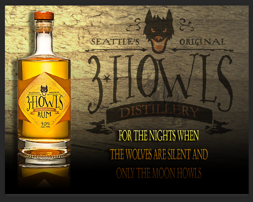
Don't think I like the text at all. Hmph.
In order to add the text, I actually went into Illustrator and created the text, then went back to Photshop and added the new text file as a Smart Object. This allows me to click the object and still be able to edit it, and everyone that opens my file will still be able to see font I want them to see. This possibly violates the spirit of this Photoshop project, but I think you could also create a text layer on photoshop and the convert that layer to smart objects. I found that if you did this in Photoshop via that method, when you clicked the smart object to edit it, you couldn't add additional text, just edit the characters you already had. I may be doing this incorrectly though. For now, I stuck to the Illustrator method.
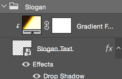
However, after applying the text, I decided I didn't really care for it. I added a gradient to the smart object layer via a clipping mask and layer adjustment gradient fill and I also added a drop shadow matching that of the bottle.
However, after applying the text, I decided I didn't really care for it. I added a gradient to the smart object layer via a clipping mask and layer adjustment gradient fill and I also added a drop shadow matching that of the bottle.
This text situation is still really bothering me.
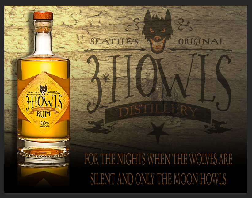
Much better. Nixed the gradient, the drop shadow, and added the star in between the lettering.
In order to create the star between the branding and the slogan, I simply opened the smart object for the brand, used quick selection to select the small start and copy and pasted into my document. Then I resized it, changed the blend mode to multiply, and lowered the opacity to match that of the branding. Speaking of the branding opacity, I lowered it down to 55% because I wanted more attention to be drawn to the bottle itself. The star is also at 55% opacity.
I had mentioned bfore that i would explain the lighting effect I applied. I thought it would tie in nicely to the moon howling part of the slogan. The illumination around the bottle is representative of the moon's glow in the upper left corner of the canvas, while the lower and right parts are darker. I feel this brings some balance into the design and helps create harmony.
Upon looking at my design, I decided to lower the bottle more.
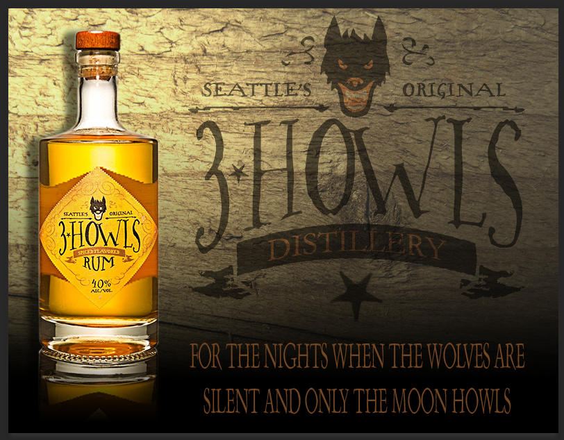
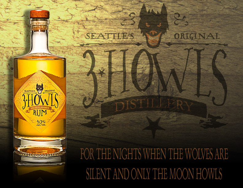
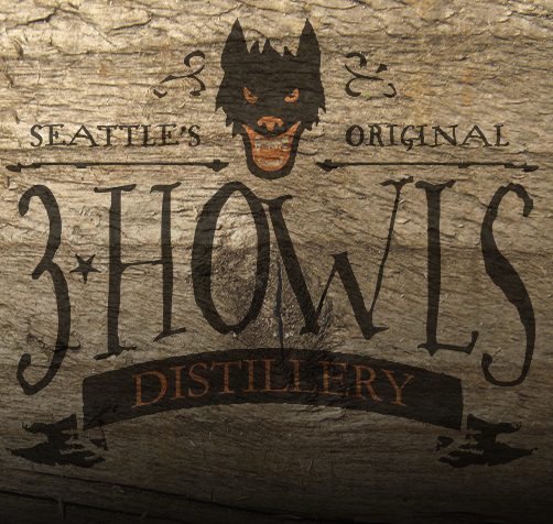
For the final image I basically just made a few tweaks. I changed the color of the lighting effect and upped the intensity a bit. I also upped the feathering on the layer mask for the bottle to 1px. Overall, I'm pretty satisfied with the turn out!

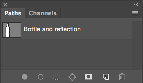
My Paths panel.
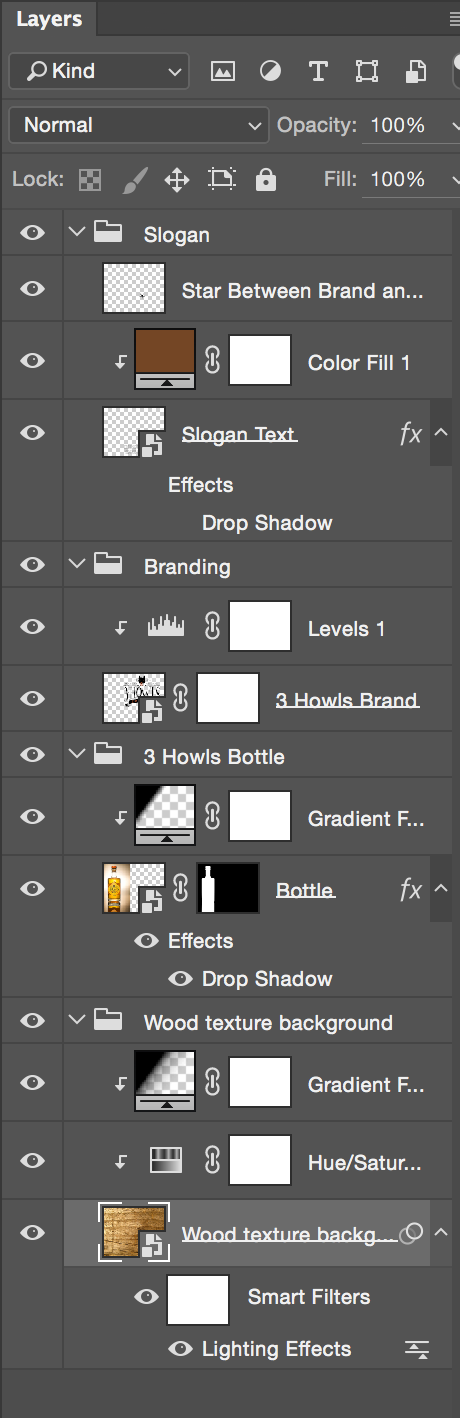
My Layers Panel
Hope you've enjoyed it!